Exhibit 4: Text
|
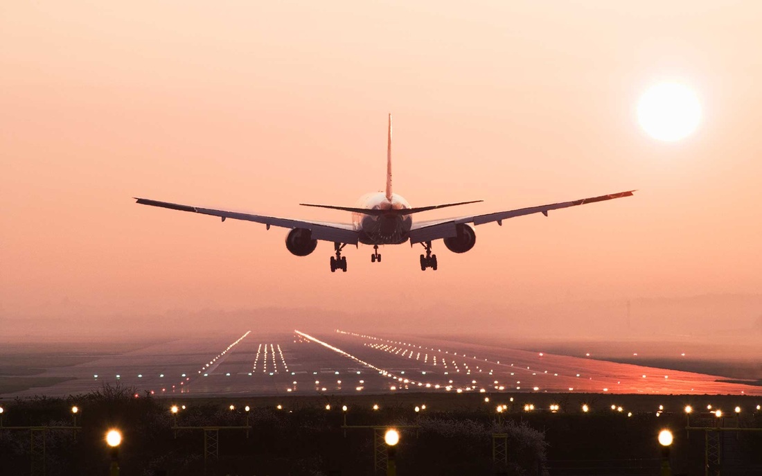
Before
|
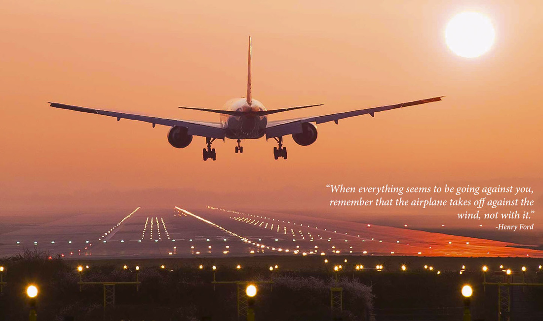
After
|
Adobe Bridge Skills Used
- Histogram- I made the image lighter so the front of the image is not as dark.
- Crop- In the crop I put the wing in the top left corner for the rule of thirds.
- Hue- I brought the reds and oranges up so the image would bring a little bit more of a pop.
Photoshop Skills Used
- Text toolbox- Was used to insert the text into the image.
Design Thoughts
- Typography- I wanted something simple but elegant with a sense of meaning in life. I decided the best way to portray what I wanted was to grab the attention of the viewers by having a text that is recognizable and familiar to themselves.
- Contrast- I changed the sunset orange to make the colors pop with a little bit more intensity. This allowed me to put in white text to allow the viewer to read the text with ease.
- Alignment- I aligned the text to the bottom right to make the text more pronounced and out of the way of the image.
- Proximity- The text and the airplane are kept close together to keep the audiences eyes on the context of the page.
PC: http://www.travelandleisure.com/sites/default/files/styles/1600x1000/public/landing1015-airplane.jpg?itok=z5HeRFcJ
